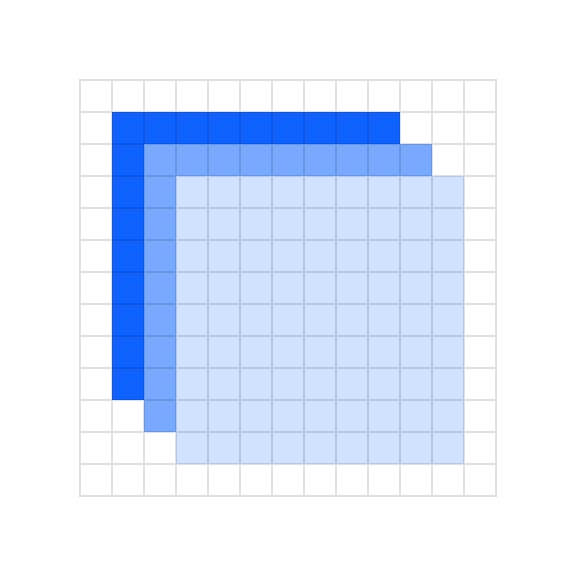
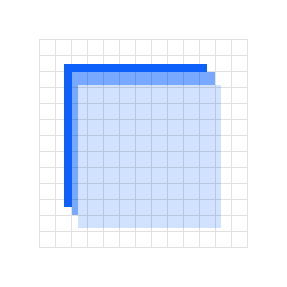
Flat style
Flat style is the boldest and most graphic illustration style used at IBM. As the name suggests, flat style uses basic geometric shapes to create people, objects, places and even ideas. It also requires thoughtful application of color and tone to delineate shapes in delightful and interesting ways. Please consider the following guidelines when crafting flat style illustrations.
Examples


Shapes
Objects in flat style illustrations should use basic geometric shapes as the foundation. An illustrator can effectively draw most any object or scene by artfully combining squares, circles, rectangles and triangles.
Two squares and two circles to make an eye.
Two circles and one square to make a heart.
Size and spacing
All objects within a flat style illustration should be at least 8px wide or tall. This measurement is very important as using a shape any thinner or shorter will be seen as a line and will change the character of your illustration. Similarly, any negative space or spacing between shapes should also be a minimum of 8px.
Grid
Building off of the 2x Grid, the underlying grid for flat style has been set at 8px, as opposed to 4px for the line style grid. This method will ensure that your minimum shape size and spacing is at least 8px and will also help make sure that your illustrations don’t become overly crowded and busy.

Snapping to grid
Flat style illustrations should be constructed using the “snap to grid” feature in Adobe Illustrator. This setting ensures that the points along your drawing can snap to the grid lines underneath your linework. The grid positioning of the line gives the precise and engineered aesthetic, which is vital to any IBM illustration.
Do make sure the anchor point lands clearly on intersecting grid lines.
Don’t forget to use “snap to grid,” or it may result in misaligned anchor points.
Layering
When shapes are layered there should be at least an 8px safe area so that the objects clearly intersect each other.

Do use clearly arranged shapes with at least 8px of separation.

Don’t use haphazardly placed shapes with less than 8px of separation.
Drawing
Objects in flat style illustration should be built using basic geometric shapes. An illustrator can effectively draw most any object or scene by artfully combining squares, circles, rectangles and triangles. This example shows the underlying geometry of the drawing.
Angles
Please use standard angles—15°, 30°, 45°, 60°, 75° and 90° are preferred. Using these standard angles will help your illustrations appear consistent. Although you can use any angle, we recommend sticking with the standard angles suggested here.
Circular curves
Create curves using the grid as your guide and use quarter circles, semicircles and full circles whenever possible to achieve pure and simple curved shapes. Following this guidance will help ensure the engineered aesthetic.
Do use clear and regular curves when possible.
Don’t use irregular curves if they can be avoided.
Organic curves
Organic Bézier curves may be used to add more realism and character to your illustration, but should be used intentionally and with precision. Basic shapes should always lay the foundation and be used to ground the more irregular curves.
Rounded corners and nesting
You can round the corners of angles in Adobe Illustrator for a fluid and controlled look. Here are some specifications to use when applying a radius to your object.
Nested lines that curve should remain equally spaced with increasing radius.
Avoid the use of different corner radiuses in a nested design.
Color
Each illustration style has a slightly different expression of color based on the characteristics of the elements being used. When layering shapes in flat style illustrations, it’s necessary to distinguish shapes, which often relies on the use of various shading techniques. For general approaches to color, please visit the illustration tips and techniques page.
Gradients and shading
Gradients can be an effective way of adding more fidelity to your illustration by implying depth, dimension and movement. They can also be an effective and necessary means of creating definition between neighboring shapes.


Transparency
In most cases, it’s recommended to use opaque shapes and avoid the use of lighting effects, such as transparency and multiply. This technique helps ensure consistent colors across all our illustrations. Transparency effects can still be implied by carefully use of swatches from the palette or by using gradients where one of the swatches blends into the background.
