Isometric style
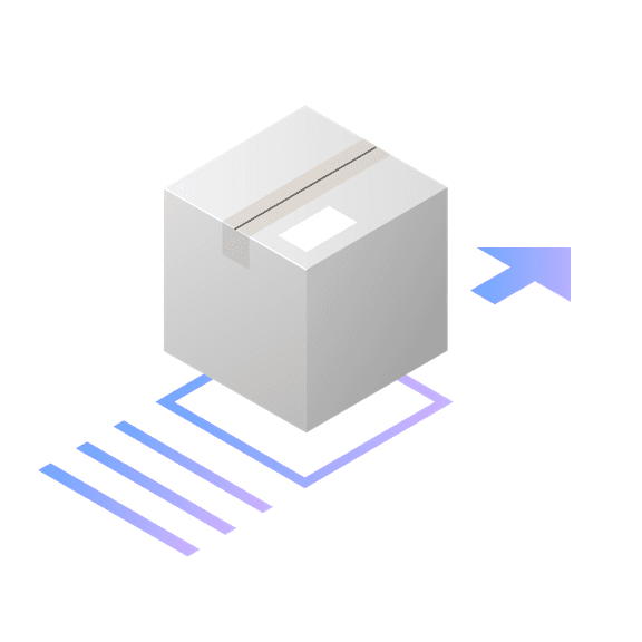
Isometric style is the most spatial and realistic type of illustration at IBM. Isometric style harnesses dimension to create captivating scenes of people and technology at work. Please consider the following guidelines when crafting your isometric style illustrations.
Examples


Volumes
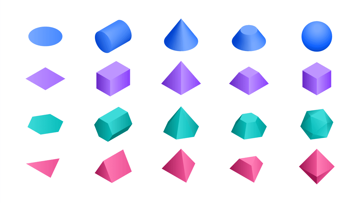
Isometric style illustrations employ the isometric projection method to create the illusion of space and dimension on a 2D surface using equal angles. Use this illustration style when the aspect of space and dimension would better help communicate a concept.

Cylinders are combined to make a magnifying glass.
A cylinder and a rectangular prism are combined to make a book.
Behavior
Due to its realism, isometric style is often used to illustrate the relationship between humans and technology. This relationship should be effortless, and illustrations should appear lightweight, with actions depicted as easy and precise. Floating objects, lean dimensions and precise alignments give the viewer a sense of airiness, ease and order.


Grid
Based on the angles of an equilateral triangle, the isometric 2x grid is essential to creating isometric perspective. To help you with alignment as you build illustrations, we’ve established an isometric grid layer within the isometric toolkit files for Adobe Illustrator.
Snapping to grid
Illustrations should snap to the intersections of the isometric grid lines in Adobe Illustrator. The grid gives the precise and engineered aesthetic, which is vital to any IBM illustration.
Do make sure the anchor point lands clearly on intersecting grid lines.
Don’t place anchor points off-grid unless absolutely necessary.
Drawing
Objects should be built using basic geometric shapes. An illustrator can effectively draw almost any object or scene by artfully combining squares, circles, rectangles and triangles. This example shows the underlying geometry of the drawing.
Angles
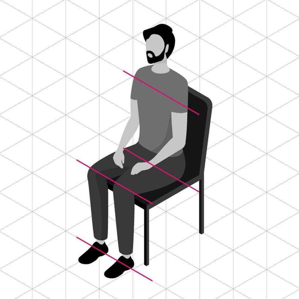
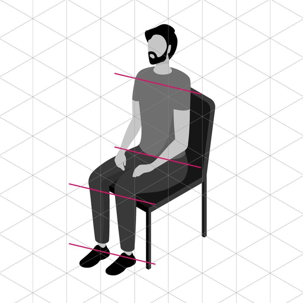
For a consistent look across all isometric style illustrations, it’s important to ground all objects by these predefined angles.
Circular curves
Create curves using the grid as your guide and use quarter circles, semicircles and full circles whenever possible to achieve pure and simple curved shapes. Following this guidance will help ensure the engineered aesthetic.
Do use clear and regular curves when possible.
Don’t use irregular curves if they can be avoided.
Organic Curves
Organic Bézier curves may be used to add more realism and character to your illustration, but should be used intentionally and with precision. Basic shapes should always lay the foundation and be used to ground the more irregular curves.

Always use isometric angles as the foundation when drawing organic curves.

Don’t use non-isometric angles for primary elements that should align to the grid.
Rounded corners and nesting
You can round the corners of angles in Adobe Illustrator for a fluid and controlled look. Here are some specifications to use when applying a radius to your object.
Nested lines that curve should remain equally spaced with increasing radii.
Avoid the use of different corner radii in a nested design.
Color
Color techniques for isometric illustrations can help render the scene with more realism than other illustration styles. For general approaches to color, please visit the illustration tips and techniques page.
Gradients and shading
Gradients can be an effective way of adding more fidelity to your illustration by implying depth, dimension and movement. They can also be applied to various surfaces to imply a point source of light or material qualities.
Transparency
Transparency can help determine an object’s materiality and its interaction with light. Whenever possible, use colors from the IBM color palette as your starting point and add transparency only when necessary. Avoid lighting effects, such as screen, multiply and overlay.

Light and shadow
Light produces shadow which helps create shape and dimension to ground objects in reality. To achieve a consistent look across isometric style illustrations, be sure to follow a common set of light and shadow patterns.
Light source
The key to lighting within the isometric style is consistency. Keep the direction, or source, of light consistent within your illustration or set of illustrations. This creates a clear relationship between an object’s shape and the shadow it casts.
Use a single light source throughout an illustration.
Don’t imply multiple light sources by using various shadow angles.
Shadow types
There are multiple shadow types to choose from, flat shadows have sharp edges, where gradient shadows fade. It’s important that they’re consistently applied within a single illustration, or within a particular set of illustrations that are intended to work together as a group.
Use consistent shadow styles throughout an illustration.
Avoid the use of different corner radii in a nested design.
Illumination
Light and gradient can be used to illuminate what’s possible with technology. Illumination can help communicate technology’s ability to highlight data, reveal insights and augment human experience.

